With the advancements of technology, businesses are now shrinking the world. Small and medium business enterprises are discovering that their business solutions are just the same with the biggest enterprises, by using the newest technological developments. One major consideration is the rapid increase in the use of smartphones and other mobile devices in conducting business. To maintain their positions and rankings, it is important for smaller companies to redesign their websites to accommodate all mobile devices.

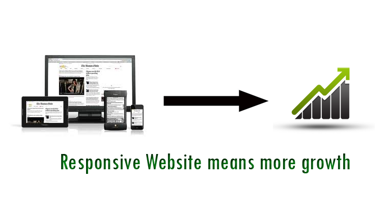
Why Create a Responsive Web Design for Business?
A responsive web design for business is a website that correctly responds when displayed on mobile devices. The viewer does not have to scroll through long menus and lists before they find the actual information that they are looking for. All above and fold information is readily available, and there is no need for a second website for mobile devices. With the use of a single content base and a single code base, responsive web design for business can give consistent content across various device types and screen resolutions.
When the consumer can access your site as easy on their smarphones as they can on a laptop, it allows them greater access to your business. People are not always near a computer, but many people carry their smartphones with them. Whether your clients are retail customers or other businesses, responsive web design for business will increases visits to your site.

What are the Benefits of Responsive Web Design?
Below are the benefits of responsive web design from Huffington Post.
- Responsive web design for business is fluid so the content freely moves across all devices and all screen resolutions. Both the images and grids and fluid. Responsive web design fluidity allows its content to fill an allotted space and retain its appearance.
- People who are on the go 24/7 are accommodated with a responsive web design, from the busy professional during the day to the wide-awake college student needing access to your site at 2:00 in the morning. No resizing or scrolling is needed for any consumer to access your site.
- The advantages of having one website that conforms to the need of all devices are significant as compared to having two separate websites. One website definitely costs less than two and the savings can be very significant.
Tips and Tools for Better Responsive Web Design
But how does one create a responsive web design? Here are four tips to solve your responsive web design problems quickly brought to you by The Webwoker.
Navigation Made Easy
Navigation menus are the backbone of every website, but they take valuable screen space on small devices, so its no wonder that they will be mostly happy initially placed outside the screen area, for example as a “off- canvas”, and then the navigation will be only visible on a button click or by doing a gesture. This recurring pattern on many websites makes it easier to work with flexible navigation.
Mediaqueries
Mediaqueries are a key ingredient in the responsive Web design. Two problems often arise in everyday work: firstly Mediaqueries do not work in Internet Explorer 8 and older versions of the browser, on the other hand they are often used when you write modular CSS, resulting in too much paperwork in the CSS and to frequent repeat of the single break point values.
Change the Order of the Content
When you switch to different screen sizes, it often happens that content slide due to their order in the source code in an unfavorable position on the page on smartphones, for example, far down. To avoid this you can use a useful JavaScript plugin called AppendAround. Here, several HTML container at various points are simply placed in the source code. Depending on the viewport size the content migrates in a different container using JavaScript, so as to occupy a different position in the source code. This saves a lot of complicated CSS tinkering.
Responsive Web Design Performance
In order not to run the risk of overloading his side, a performance budget should be set at the beginning of a project to which you hold consistently over the course of development. Performance is also not just a developer issue. Designers should also scrutinize in their design, whether extensively used gradients, shadows, web fonts , large-format images and much more are really useful. All images and graphics that are integrated should be optimized in terms of file size. Here to tools such as JPEGmini, ImageOptim or SVGO will help. It is also important to test the speed of website in the meantime. Tools such as Google Page Speed or MobiTest will help to take the performance of a page under the microscope and offer tips for improvement.
As the number of people using mobile devices to access the internet grows, your consumer base can grow with it through responsive web design for business. Businesses that fail to grasp the significance of mobile devices on internet use risk a decrease of visitors to their website.